About

From Statistics to Story

Linear vs. Non-linear Data Storytelling for SIN

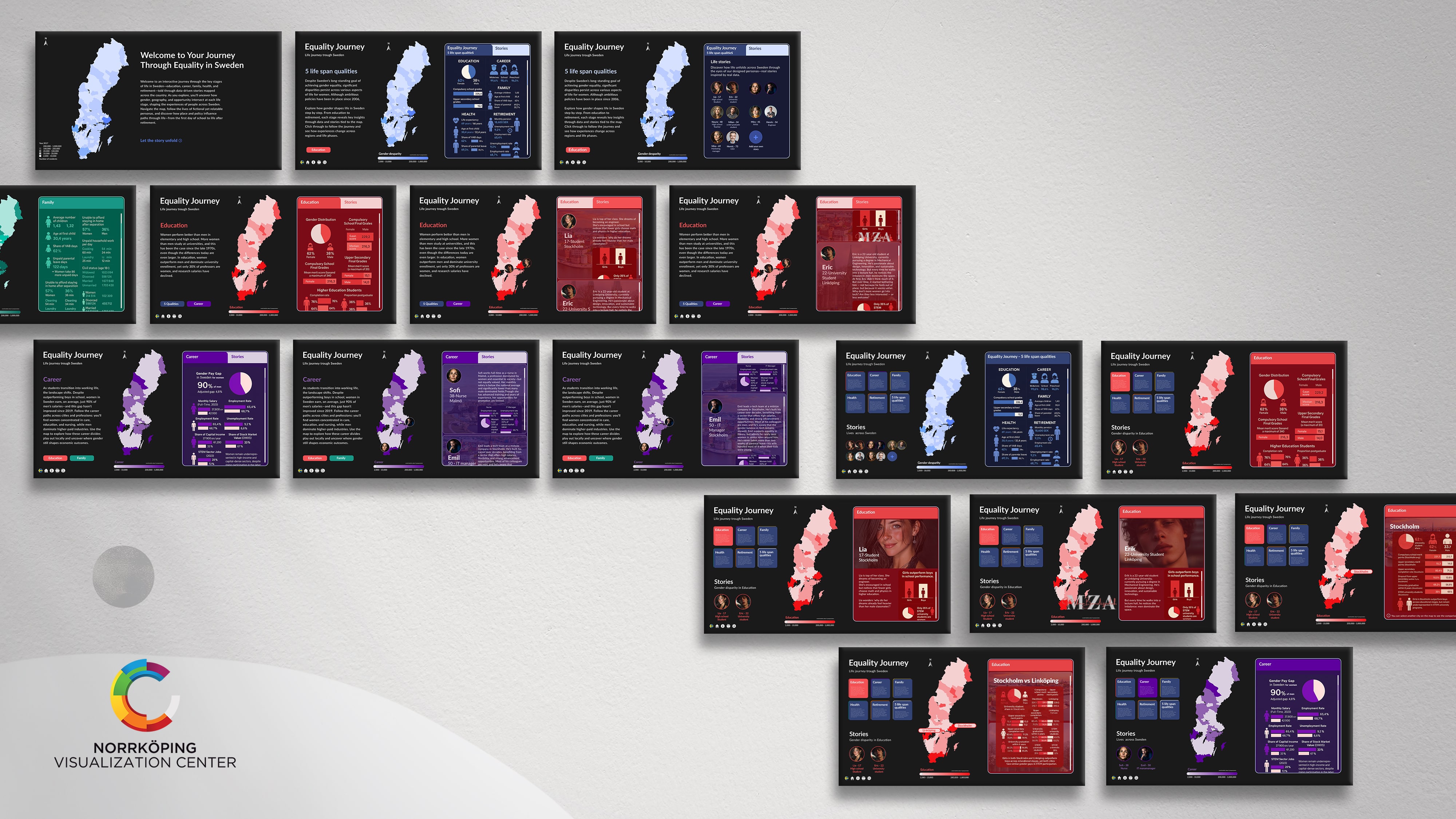
This project examines how story structure influences public understanding of statistics by comparing two content-equivalent interfaces: a guided, linear journey and a flexible, non-linear canvas centered on Swedish gender-equality indicators. Data, tone, personas, and geography were held constant. Only the structure was varied to determine which approach best supports non-experts in engaging with the material, comparing locations, and retaining key messages. I expected the linear version to reduce cognitive load initially, while the non-linear version would facilitate comparisons and personal relevance once users were oriented. The study took place within the context of Sweden in Numbers (SIN) at Visualization Center C, which already encourages map-based exploration of official SCB data.

See more

(01) Background

Concept development

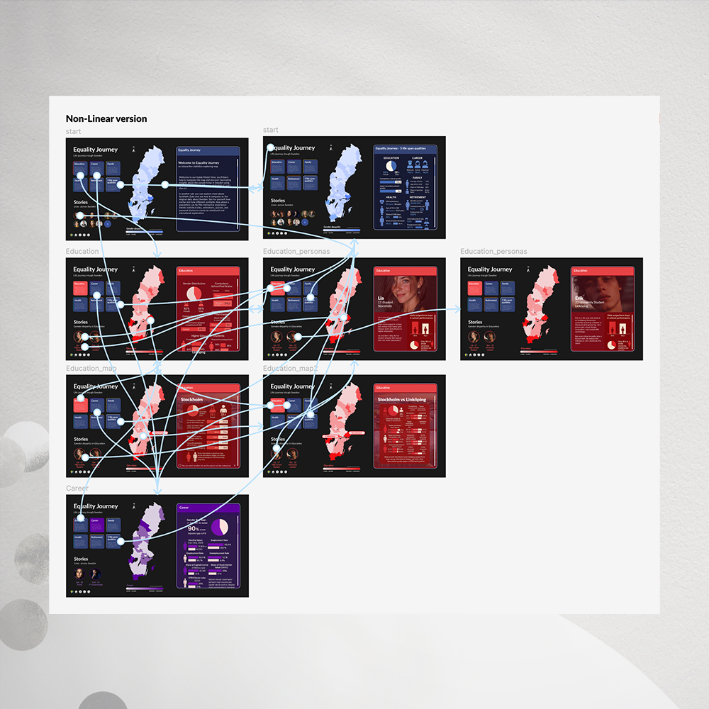
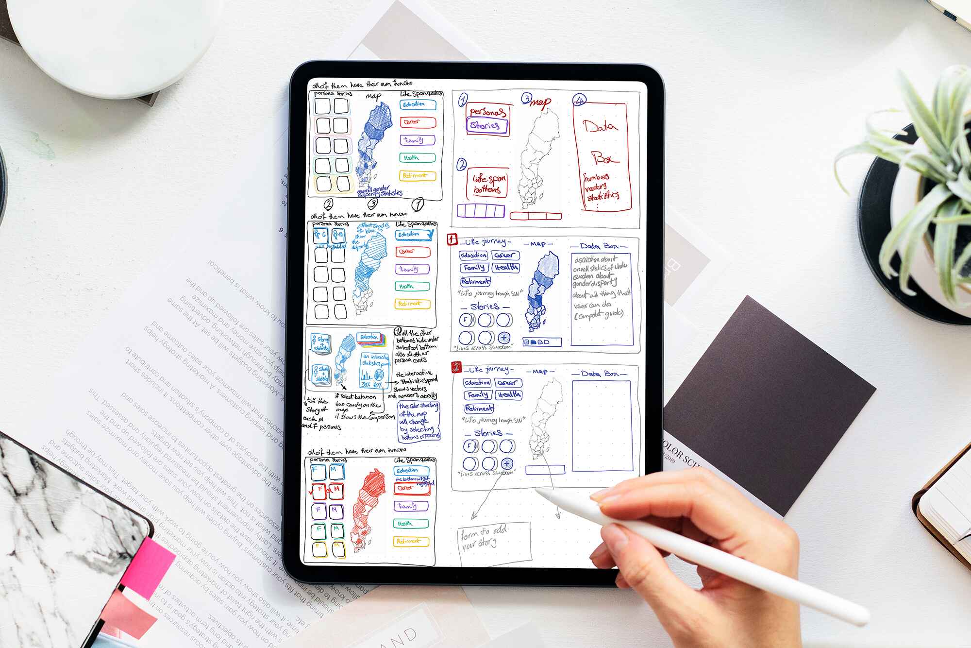
I approached the project as a story-structure question, focusing on Sweden in Numbers. Instead of using the map as the main narrative thread, I made it a starting point to help define the scope and highlight differences. I developed two options. The first was a non-linear layout with always-visible personas, buttons for different life stages like Education, Career, Family, Health, and Retirement, a national map, and one main panel for explanations. The second option was a linear path with clear Next and Back steps, starting with a short explainer, then evidence, and ending with short persona stories. I used indicators to highlight gaps and kept the text brief to make the purpose clear.

Prototype development

Both versions were built in Figma with strict content equivalence, so structure was the only variable. The non-linear prototype followed “many starts, one destination,” with flat navigation, no dead ends, consistent stage colors, and a right-hand panel that updated from any entry point. The linear prototype used a fixed sequence: Welcome, overview, chapter explainer, and stage stories or data. The map was reserved for localization while the flow controlled navigation. Where data granularity was missing, clearly labeled synthetic placeholders tested interaction patterns.

No items found.

(02) The Process

Evaluation and User Test

A qualitative, comparative evaluation and user test with general-audiences assessed clarity, engagement, and usability using a standardized script and targeted tasks such as orientation, comparison, and takeaway recall. Results showed a consistent split: the non-linear route improved exploration, personal relevance, and city-to-city comparisons when brief onboarding explained panel updates. The linear route improved orientation, pacing, and cognitive ease, and was often seen as more official. The map was most effective as a locator and scope control, while explanations and comparisons were best placed in the panel. The recommendation is a hybrid approach: a short guided primer, followed by a structured non-linear canvas to support agency and comparison.

This work shows how story structure affects user experience and offers practical ideas for public statistical visuals, like using panels for explanations, maps for location and scope, and personas to make data more relatable. It also reflects on the process and its limits. The main takeaway is to use a hybrid approach: start with a short, guided introduction, then move to a structured non-linear canvas. The study notes its limits, such as a small sample and some asynchronicity, and gives practical advice for exhibitions and education.