About

HAMISHE app

Designing a Unified UI System for a Multi-Format Wellness App

While most people want to improve their well-being, many don't have time for the gym, can't afford a specific trainer, or struggle to find easy-to-follow, local content. Hamisheh is a visual media platform that offers online video classes to support a healthy lifestyle. Users can choose from a variety of courses, including strength training, yoga, mindfulness, emotional wellness, self-improvement, and healthy cooking. The platform helps users easily find expert guidance. They can choose content that fits their interests and goals, making it easier to build healthier habits. The main goal for the platform is to offer high-quality, instructor-led health content that is simple, affordable, and available anywhere.

See more

(01) Background

The design challenge: one brand, one UI, many content types. All united for a seamless, engaging user experience that drives user satisfaction and long-term loyalty.

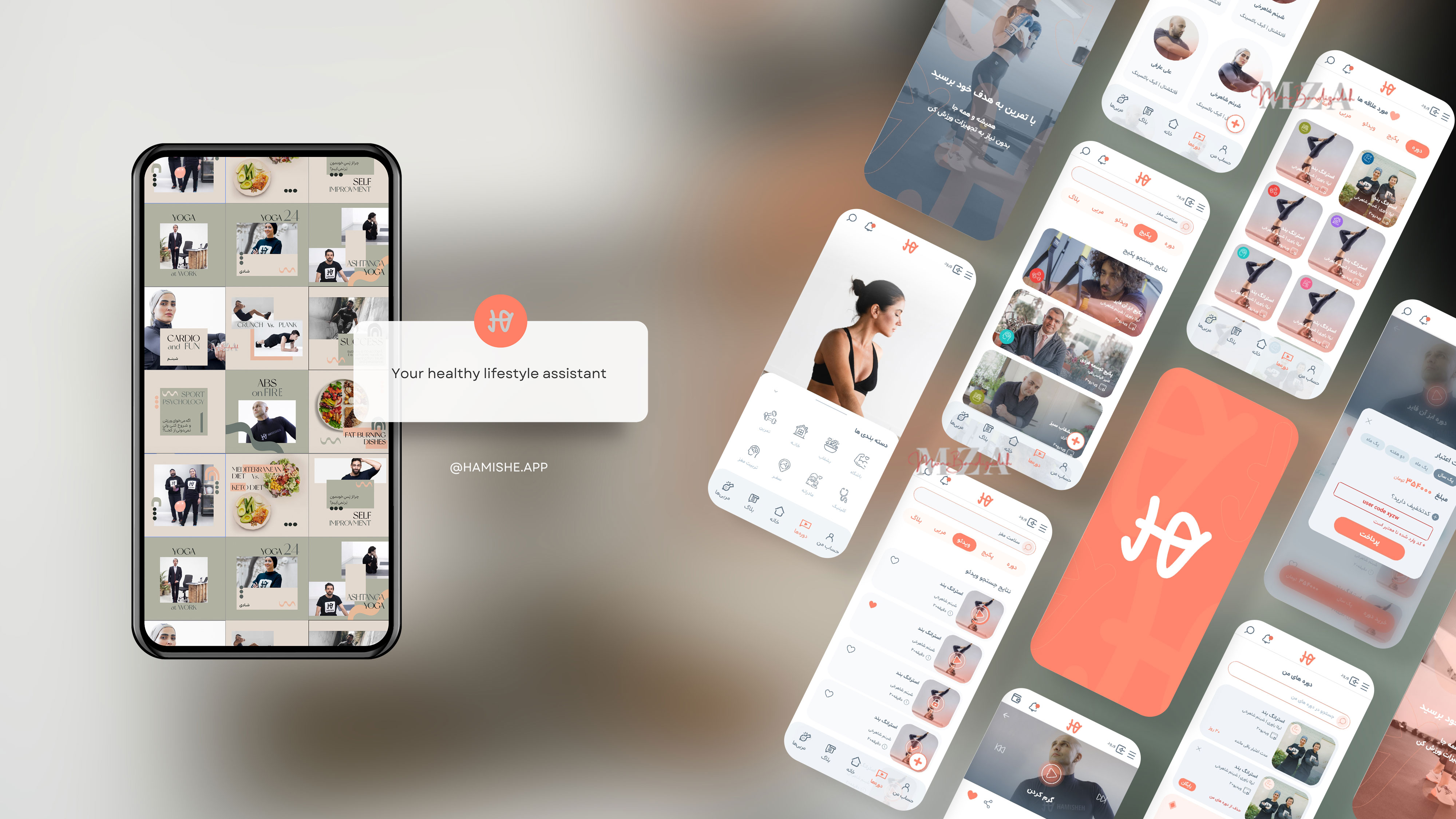
HAMISHEH offered diverse content, but the experience felt fragmented. My solution was to create a visual system and UI that unified all formats. I designed a consistent interface, using the same logic and layout, so users could move between categories with less confusion, feel more comfortable in the app, and find greater value in purchasing full packages instead of single classes.

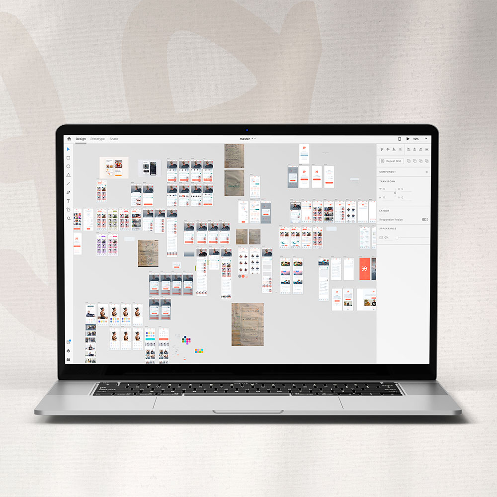
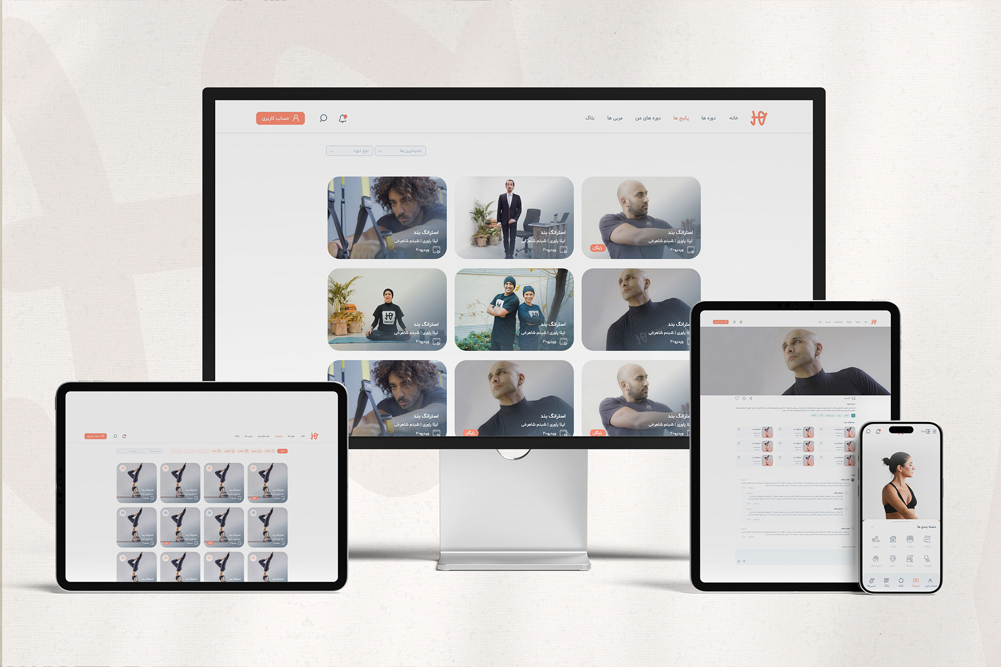
I began the process with a UX workshop to identify ways to better serve the main users. From this, I found opportunities to unify the visual design system, improving usability and consistency. I enhanced navigation, typography, spacing, and layout, which made information easier to access. Updated content, including photos and videos, increased engagement. I then worked with developers and the product team to map infrastructure limits, existing screens, and the content roadmap, ensuring our designs were feasible and strategically aligned. Guided by these inputs, I turned sketches into a foundational design system, creating a color architecture based on the corporate palette and a unified icon set on a shared grid. I added micro-animations for play, pause, and loading to clarify interactions and established state rules that improved feedback. In parallel, I applied the same design elements to the website for seamless parity between app and web, enhancing user familiarity and reducing the learning curve.

No items found.

(02) The Process

I used the videos, photography, interactions, and dynamic layouts to keep visitors engaged, working with the team to present content in an easy to understand way. The unique angle was prioritizing consistency of states and feedback, such as icons, motion, and status changes, before surface decoration. Once those were predictable, even a cooking class and a psychology session felt related. The result was a clean, modern design that highlights the company's commitment to a healthy lifestyle and accessible production.

Beyond the product UI, I also owned the content and marketing design stream. We worked with the sales and marketing team to create plans to encourage loyal users and attract more potential users. One plan involved using social media like Instagram and holding different events. I led the design team, set standards for templates and asset handoff, and worked closely with the video production team. I also designed motion graphics for IG ads, defined the primary visual format for social media, and created print and digital ad packages.