About

SIZZLE

CI & Product Design for a Home-Cooked Meals Marketplace

Sizzle is a Canadian marketplace startup that connects neighbourhood cooks with customers looking for fresh, home-cooked meals. Our goal was to create a warm, inviting brand and a mobile ordering experience that feels easy and trustworthy from the start. We began by speaking with potential users and conducting interviews to understand their needs and concerns. The main challenge was helping new users feel comfortable buying from cooks they didn’t know. To solve this, we focused our design on clear structure, friendly visuals, and clear feedback at every step.

See more

(01) Background

We set out to build a two-sided marketplace with reliable logistics that works for everyone. Local cooks needed an easy way to list and sell their meals. Customers needed to trust the food’s quality and safety before ordering. Delivery also had to be smooth and dependable. To meet these needs, we designed three panels at once. The Cook Dashboard makes it easy for cooks to sign up, verify profiles, build menus, set availability, manage orders, get paid, and see tips for better performance. The Customer App helps people discover meals and cooks, with simple browsing, filters, clear ratings, verification, hygiene notes, an easy cart and checkout, real-time tracking, and reviews. The Delivery Panel manages batching and routing, pickups and drop-offs, status updates, issue reporting, and earnings. Together, these tools help us grow our network of cooks, increase first-time and repeat orders, and make sure deliveries are on time and reliable.

No items found.

(02) The Process

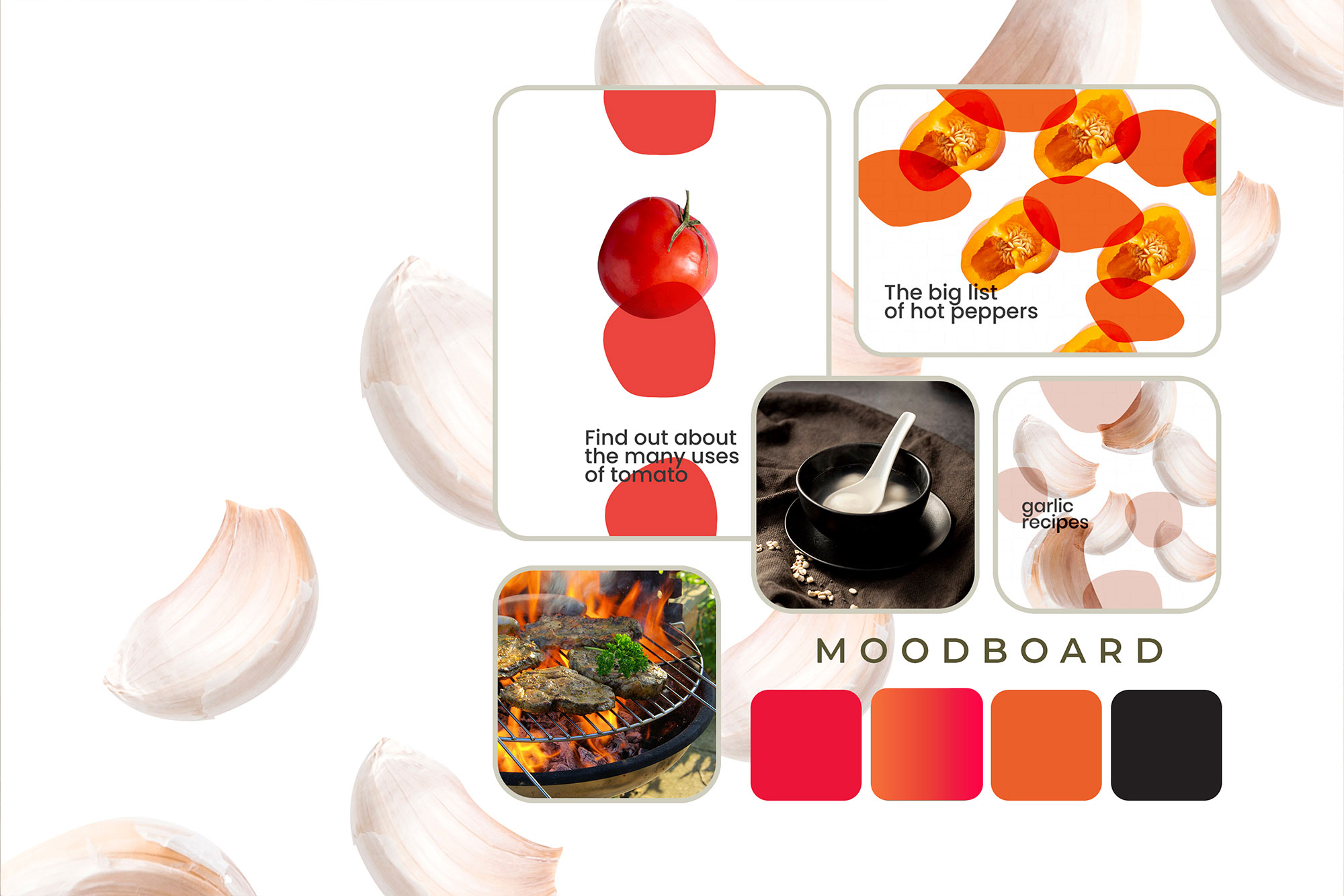
I worked on brand identity and product design together, ensuring the Cook Dashboard, Customer App, and Delivery Panel stayed in sync. Collaborating with the product team on constraints, flows, and priorities, I built a shared foundation: a warm orange and coral palette, a flame-inspired wordmark, and a grid-based icon set. This gave the system a consistent feel across all entry points. I then set up essential details like type scales, spacing, and states (loading, success, error) so everything behaved the same across all panels.

Once the basics were set, building screens and components became repeatable. I built cards, rails, trust badges, ratings, a menu builder for quick publishing, and a delivery flow organized as a checklist. I stayed close to stakeholders: cooks handling uneven photos and last-minute changes, delivery operations managing timing and reroutes, and support teams flagging unclear copy. Each feedback improved the system—guiding clearer photo rules, friendlier micro-copy, better ETA and refund signals, and subtle motion cues that reassured users.